
I led the design and prototyping for the view control experience of nTopology's 3D modeling interface.
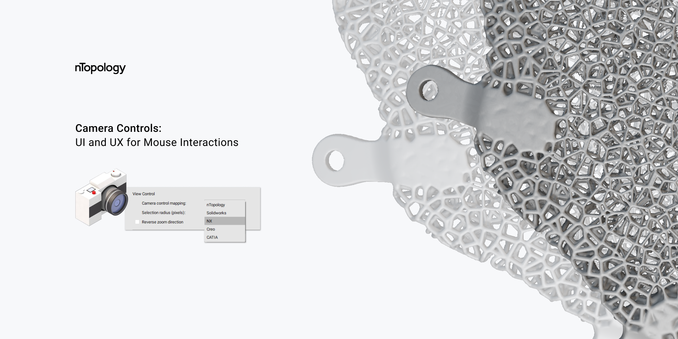
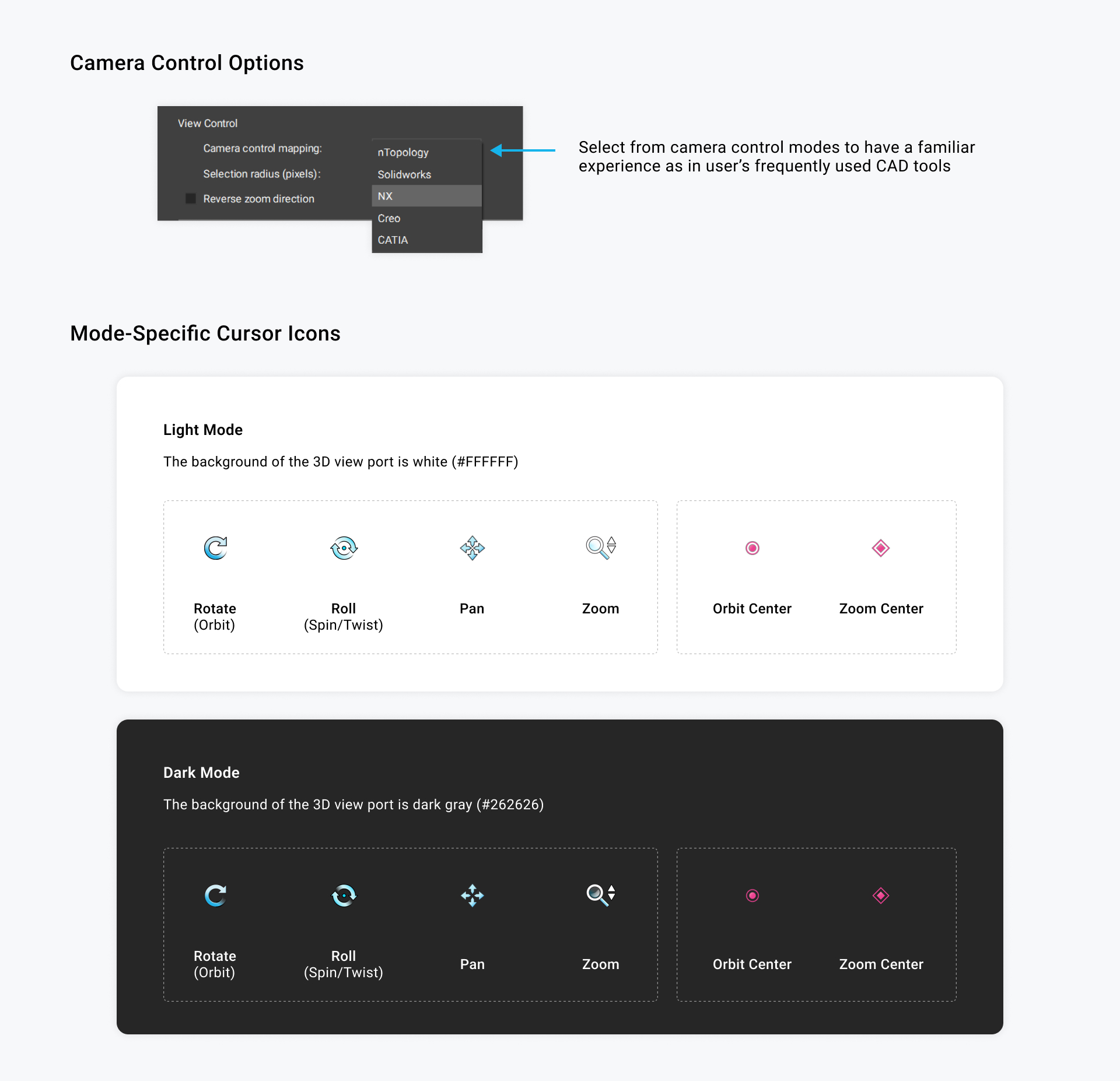
The new view control interface is equipped with mode-specific cursor icons, and allows user to map hardware input to match another CAD software that their muscle memory is already familiar with.
My Role
Lead Product Designer, Lead 3D UX Prototyper
Tools
Figma, Adobe Illustrator, Unity, Qt, pen & paper, Jira
Team
Engineering Team, Product Manager, Myself
Duration
Q2 2022
Project Background
Controlling Views in 3D
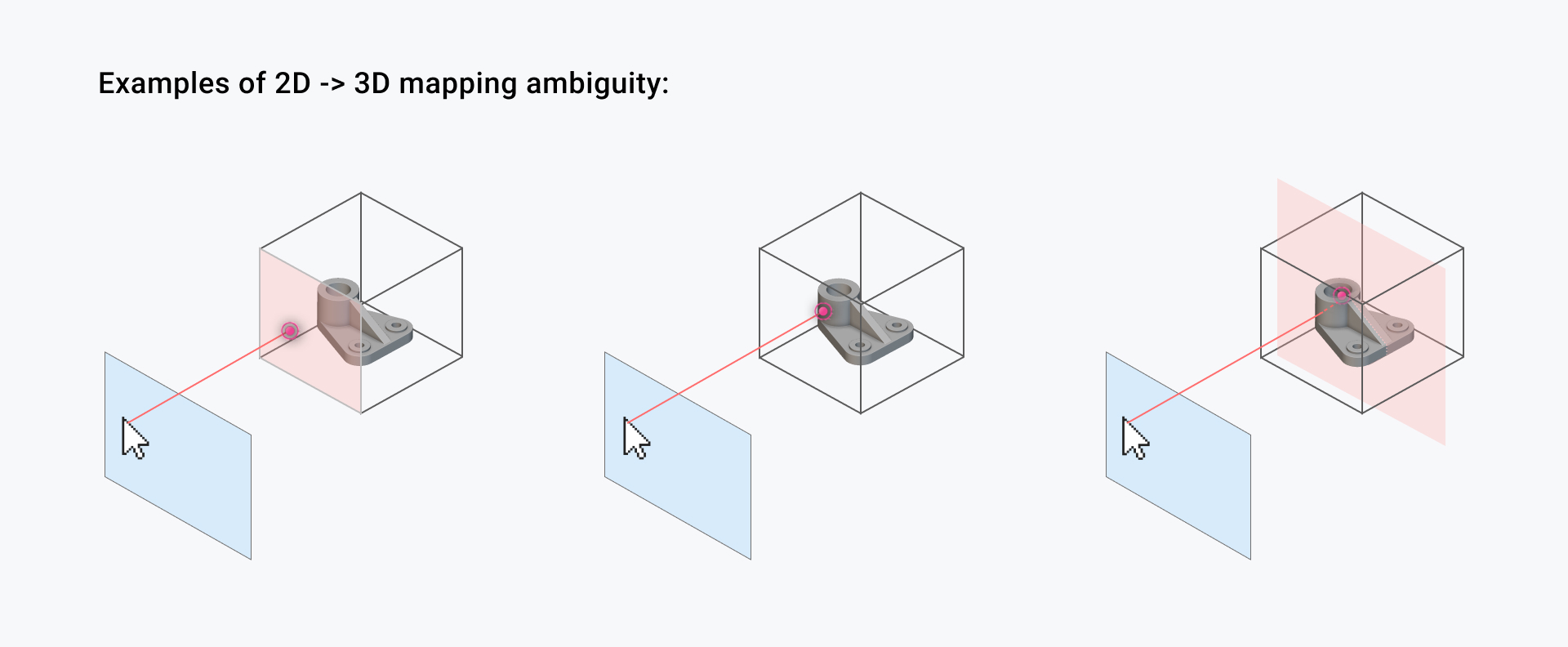
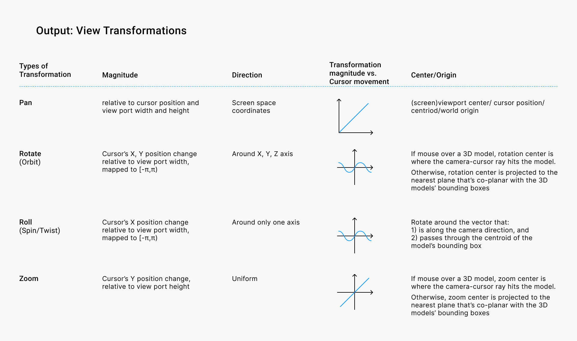
Controlling the camera view of 3D models is more complicated than navigating a 2D Canvas.
For example, in 2D UI, the cursor position maps deterministically to the x and y coordinates of a 2D pixel grid. Similarly, translation and rotation are also based on x and y positions which can be easily coordinated with respect to cursor position and movements. But in a 3D scene, the x and y positions of the cursor referenced from a 2D screen is insufficient to determine which point in the 3D space the user is intending to point at, orbit around, or zoom around.
- On one hand, translation and rotation in 3D have more degrees of freedom than 2D transformations.
- On the other hand, mapping cursor inputs to 3D space requires additional depth-related information, which the 2D cursor position doesn’t provide.
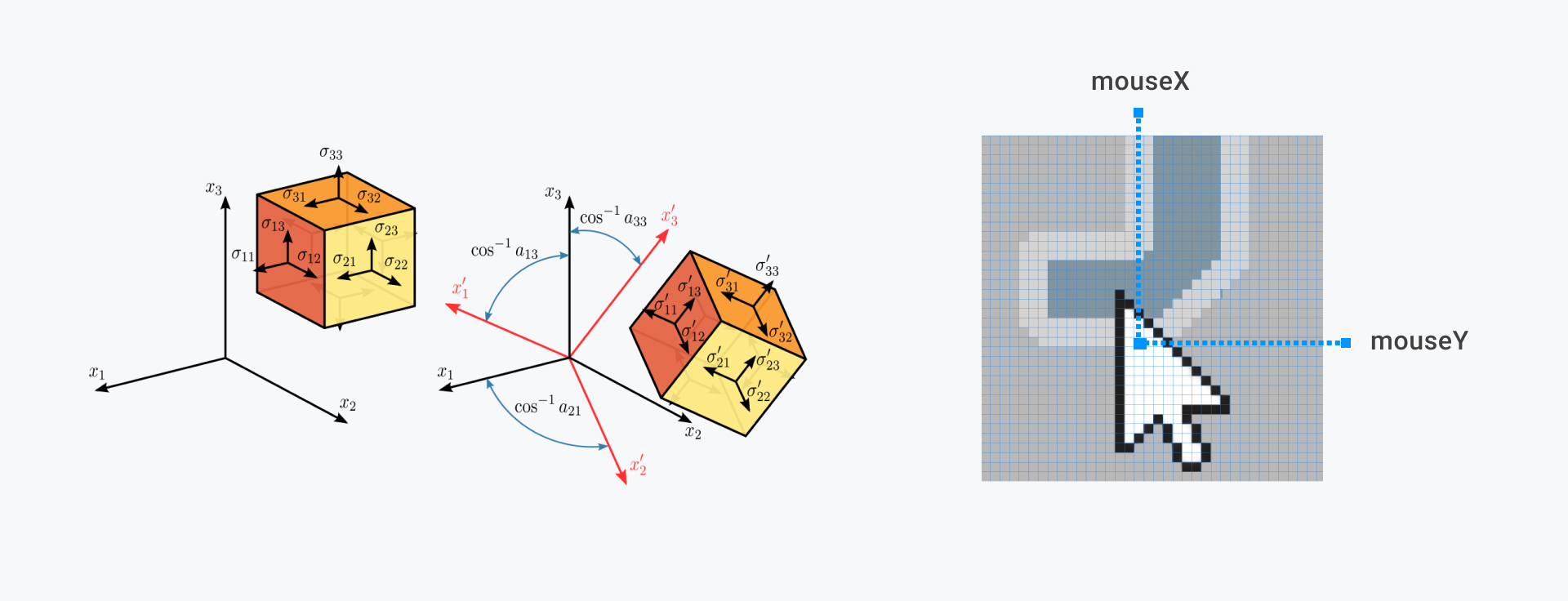
Mapping a screen space (x, y) position to the world coordinate system requires multiple stages of mapping, making it ambiguous to translate user’s screen space input into 3D space.
Previously in nTopology
The user experience with Camera Controls (pan, zoom, roll, orbit) in nTopology was considered unintuitive for mainly two reasons:
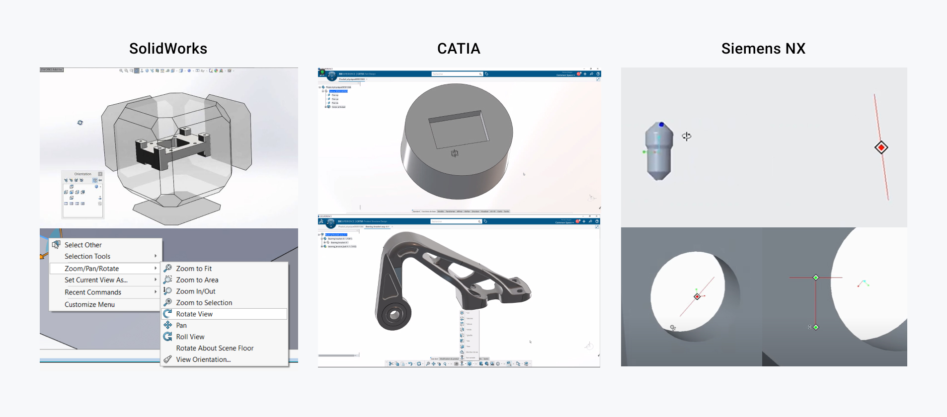
- ① Muscle Memory and Familiarity with Existing CAD Interfaces: CAD users who uses nTop are used to the mouse and keyboard gestures in the other software they use.
- ② Lack of Visual Cues to Indicate Current Control State: The cursor icon always stays the same no matter what view control mode user is in.
Design Process
Mapping the I/O Variables
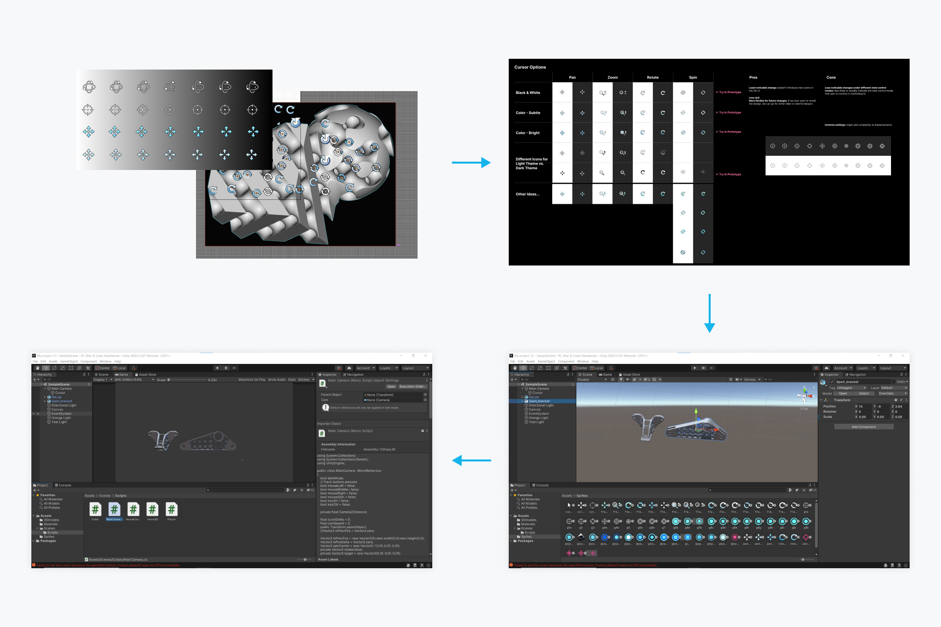
To indicate to user which camera control mode (zoom, pan, orbit, etc.) they are in, I designed a set of icons that correspond to each mode and accentuate cursor position relative to the 3D scene.
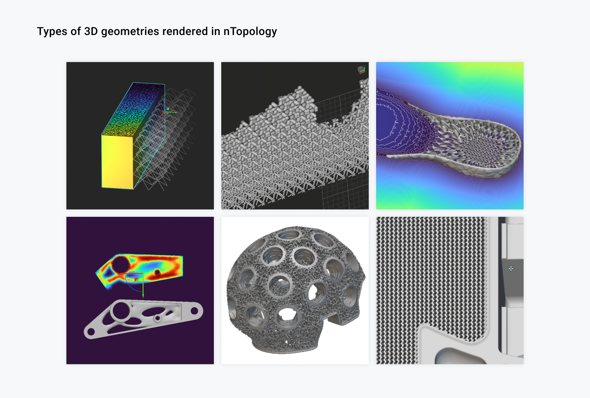
However because the type of geometries in nTop is much more complex than traditional CAD, the requirements for effective visual perception of icons in the 3D scene is very high. Therefore, this set of icons are amongst the most challenging (and interesting) icons I’ve ever designed.
I surveyed which other CAD software are frequently used alongside nTopology, and had shadowing sessions with internal users (application engineers) to learn about their setup and observe how they control 3D views while designing a component.
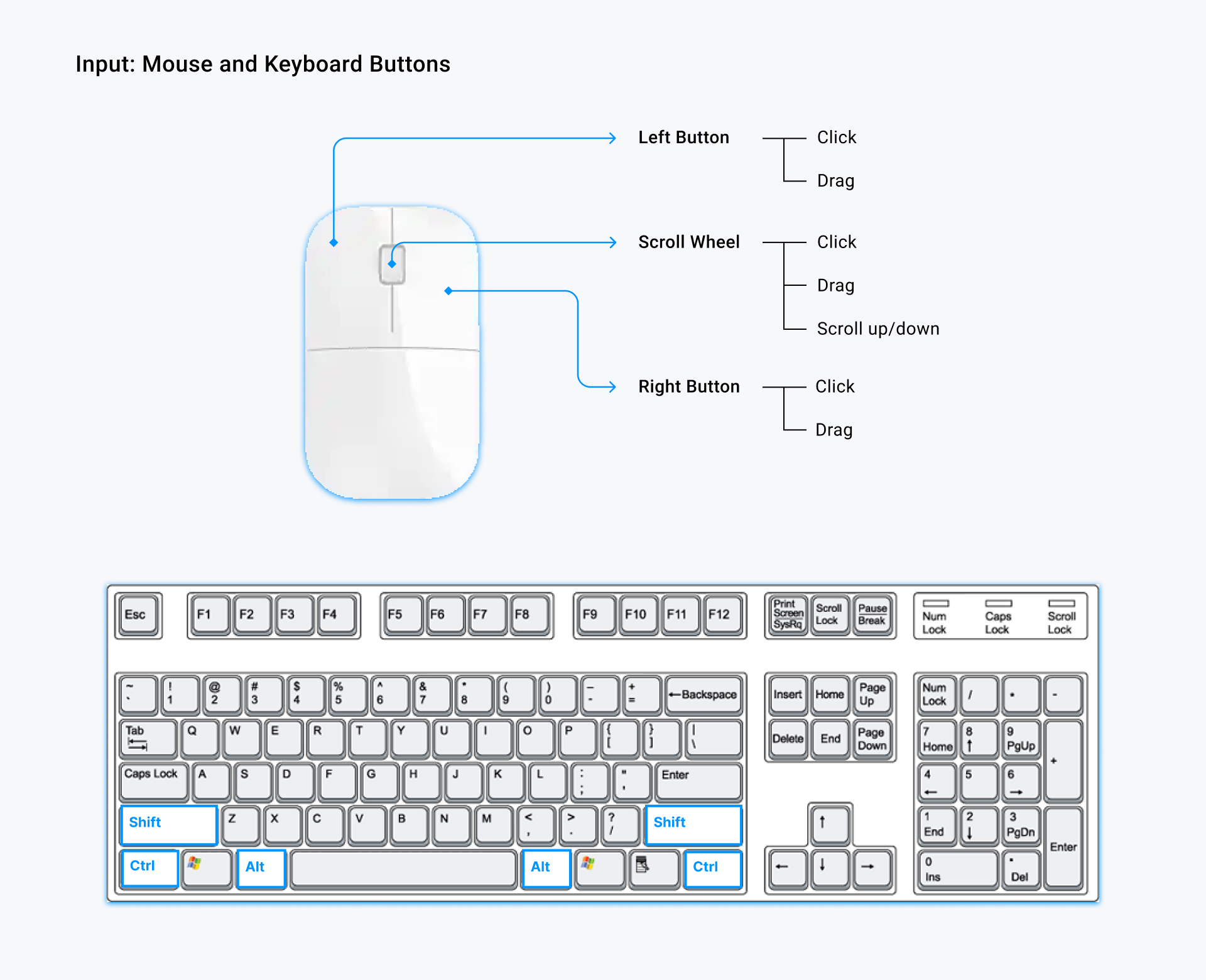
I then analyzed the I/O (key press, scroll wheel directions, orbit and zoom centers) of these CAD software according to the same metrics as in the chart.
Visual Aspects of Cursor Icons
The types of geometry designed in nTopology are often more complicated and intricate than the 3D models made in traditional CAD. This means that there is a dense amount of variations in brightness and hues in the 3D scene, making it hard to discern the cursor.
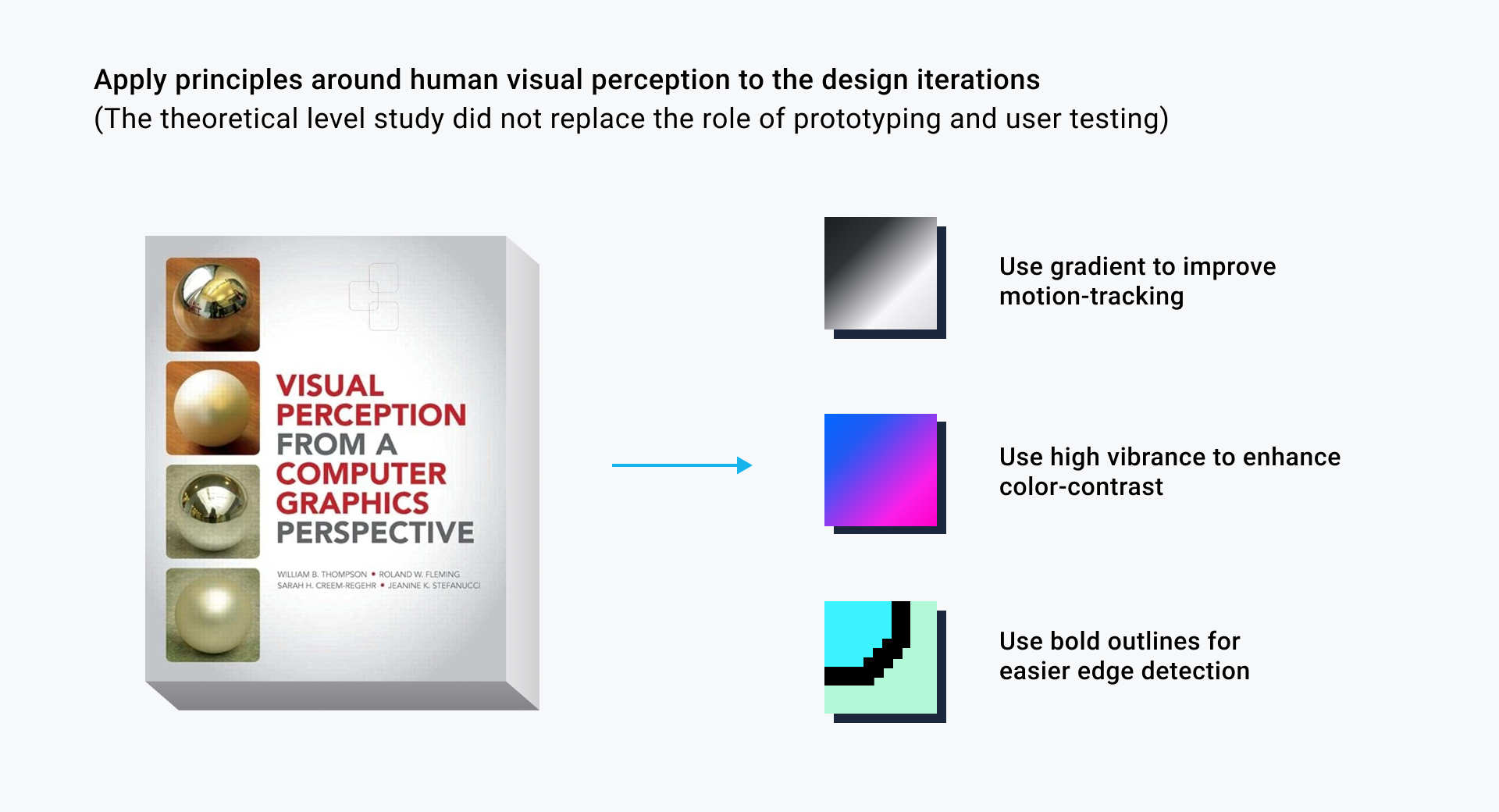
Therefore, to design icons that can be easily spotted and tracked by the human eye in this context is challenging. I looked into books and papers on human visual system to discover what are the effective visual cues I can incorporate to design the cursor icons.
Prototyping
Testing 2D Designs in 3D
After exploring design options in 2D and placing the icons against a variety of screenshots from nTopology, I noticed that the color contrast and readability of these icons varies quite a bit depending on the light reflections of the 3D models.
So instead of testing the icons against static screenshots of the 3D scene, I created a 3D environment in Unity (using a similar three-point lighting and dark/light backgrounds as the original app), imported 3D models of different geometric details, and imported cursor icons as 2D sprites in Unity to test the look & feel in action.
Design Outcome
Live Demo
Improvements in Camera Control
- The first objective of this project is to incorporate familiar camera control patterns as seen in the most commonly used CAD software that nTopology users spend time with.
- The second objective of the project is to clearly indicate to user what modes they are in, by designing a set of cursor icons to correspond to the control modes that the user is currently in.
For the purpose of QA for our new camera control UI, I created a test file repository by aggregating all the non-confidential nTop files (by reaching out to the presales teams), selecting and organizing them into a structured set of test cases, such that both designers and engineers can use those files to valid the usability of our prototypes.
While this test set might seem small at first, it is the first systematically organized set of cases that allows nTop's R&D team to quickly validate usability across the 6 main industries where nTop users come from.
